The expressions “feeling blue,” “seeing red,” “green with envy” are certainly colorful. But there’s significant science illustrating how humans react to color, and new theories explaining why individuals gravitate toward a “favorite” hue.
At Nutriventia, we understand how color supports well-being, and apply color psychology strategically to the marketing of our signature ingredients.
Color psychology is the study of how colors and color patterns influence human behavior. Different colors impact mood and outlook by triggering psychological, biological, and even cultural associations, affecting emotions, heart rate, and energy levels. Color perception is largely subjective, but the human brain generally categorizes colors into two main spectrums: high-arousal, warm tones and low-arousal, cool tones.
In her article “How Color Psychology Affects Moods, Feelings, and Behaviors,” Kendra Cherry MSEd describes, “Color is a powerful communication tool that can signal action, influence mood, and even elicit physiological reactions. Certain colors have been associated with physiological changes, including increased blood pressure, increased metabolism, and eyestrain.”
In a 2020 study, researchers surveyed 4,598 participants from 30 different countries to evaluate the emotional associations of color. Participants were asked to associate 20 emotion concepts with 12 color terms. According to the study results:
- Black: 51% of respondents associated black with sadness
- White: 43%, relief
- Red: 68%, love
- Blue: 35%, relief
- Green: 39%, contentment
- Yellow: 52%, joy
- Purple: 25%, pleasure
- Brown: 36%, disgust
- Orange: 44%, joy
- Pink: 50%, love
In a meta-analysis of 72 studies published between 1990 and 2025, researchers concluded that lighter colors, notably blue, green, yellow, and white, enhance mood, reduce stress, and promote physiological calmness by slowing heart rate and lowering blood pressure. Darker colors, such as black and deep red, were associated with anxiety, heightened physiological arousal, and more negative emotional interpretations. Study author Paul Andrew Bourne, PhD, writes, “These contrasting effects reveal how color operates not only as a perceptual phenomenon but also as a behavioral cue that shapes attention and mood.”
Early research from H.J. Eysenck identified a universal hierarchy of color preferences with blue being the most popular, followed by red, green, violet, orange, and yellow.
However, color preferences and their effects may differ in workplace settings. In one study, researchers investigated the effects of nine monochromatic office colors on clerical task performance, mood, and color preference among 675 participants.
Interestingly, those in the white office made significantly more proofreading errors than those in the blue and red offices. When assigned to an office painted in their preferred color, participants in the green and red offices rated their work environment more favorably than those in the yellow and orange offices. Participants in the white, beige, blue, and gray offices also reported greater satisfaction with their office color than those in the orange office. Additionally, purple and yellow were perceived as the most distracting colors for work, whereas white was considered the best color for concentration. Participants working in purple, orange, red, and yellow offices reported significantly higher levels of distraction than those in green, gray, beige, and white offices.
Healing with Color: Chromotherapy
There are numerous non-invasive, non-pharmaceutical therapies designed to help relieve a variety of physical and mental discomforts. Chromotherapy (also known as color therapy or colorology) is one such approach that aims to restore balance and alleviate aches, pains and other health concerns. Chromotherapy uses colored light at different wavelengths to influence neurohormonal pathways, particularly those involving melatonin and serotonin.
The authors of a study exploring the efficacy of chromotherapy in psychiatric treatment write, “The main hypothesis of chromotherapy is that specific colors of the visible spectrum are activators or inhibitors of complex physiological, biological and biochemical processes in the human brain.”
A research team investigated how looking at flower colors impacted mood and psychological responses when participants looked at different colored flowers for three minutes; they were assessed with Profile of Mood States (POMS), electroencephalograms (EEGs), heart rate variability, and skin conductivity. Researchers found that viewing yellow and red flowers resulted in a significantly higher sense of relaxation, cheerfulness, and comfort than viewing white flowers.
Other research investigated color therapy in specific health challenges. One clinical trial found that blue-colored therapy rooms reduced acute anxiety in 190 patients undergoing chemotherapy. Another study found that purple, yellow and orange light exposure three times a week for 45 minutes per session significantly reduced fatigue and depression, as well as improved quality of life in Parkinson’s patients.
Why Your Supplement Color Matters
Beyond therapeutic settings, the principles of color psychology have influenced design across healthcare, wellness, and consumer products. Although the efficacy of a nutraceutical ingredient is determined by its composition, formulation, and supporting scientific evidence—not its color, visual identity can play an important role in communicating a product’s purpose. Thoughtful use of color helps generate intuitive product recognition and a consistent brand experience.
Inspired by well-established color associations, Nutriventia has developed a distinctive visual identity for its branded ingredients. Each color has been selected to reflect the intended application of the ingredient, while the ingredient’s performance remains grounded in scientific research and clinically evaluated formulations.
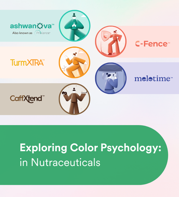
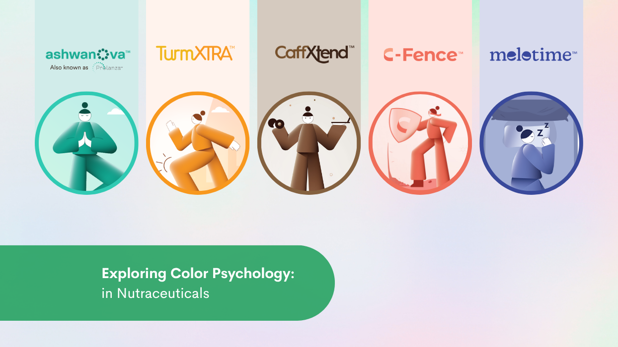
Teal: Often associated with balance, tranquility, and mental clarity, teal evokes a sense of calm and emotional resilience. Inspired by these associations, Nutriventia represents its sustained-release ashwagandha ingredients, Ashwanova™ (also known Prolanza®), as teal to reflect their intended and clinically proven application in stress management, relaxation, and cognitive well-being.
Golden-Orange: This hue is commonly linked with warmth, optimism, and vitality. These qualities are reflected in TurmXTRA®, Nutriventia’s sustained-release curcumin ingredient, where the color serves as a visual representation of its intended role in supporting mobility, joint health, and overall wellness.
Brown: Brown is frequently associated with stability, reliability, and endurance. Nutriventia uses this earthy tone to represent CaffXtend™, its sustained-release caffeine platform, reflecting its intended application in maintaining alertness, mental focus, and energy throughout the day.
Warm Coral: This hue conveys renewal, vitality, and care. It has been chosen to represent C-Fence®, Nutriventia’s sustained-release vitamin C ingredient, to visually align with its intended role in supporting antioxidant defenses, collagen formation, immune health, and tissue repair.
Purple: Traditionally associated with calmness, relaxation, and restoration, purple has been selected to represent Melotime™, Nutriventia’s sustained-release melatonin ingredient, reflecting its intended application in supporting healthy sleep initiation and maintenance.
A Visual Language Inspired by Science
Color is one of the first elements consumers notice, and it can help communicate a product’s identity before they read the label. At Nutriventia, our color palette is inspired by established psychological associations and aligned with the intended applications of our branded ingredients. While the colors themselves do not produce physiological effects, they provide a consistent visual language that complements the science, innovation, and clinical evidence behind every formulation.
Conclusion
From shaping mood and behavior to inspiring healthcare applications and product design, research continues to uncover the relationship between color and well-being. In nutraceuticals, thoughtfully chosen colors can serve as a visual language that communicates an ingredient’s purpose while complementing the science behind it. As our understanding of color continues to evolve, its role in connecting science, design, and human experience remains as vibrant as ever.
Reviewed by Sneha Sawant Desai, PhD